Wednesday, 30 October 2013

Exploratory stage evaluation

As the exploratory stage of my course draws to a close, I have to write a review of how I found the course.
Each stage varied greatly, but the umbrella name of the project was relationships. The main aim of each segment was to explore the different ways of working and decide what we fancied carrying on. As I had few expectations, I hardly had aims apart from have fun and use as many materials as humanly possible. I think I managed that, as I spent a lot of time experimenting for experiments sake and had loads of fun.
I am going to tackle this bit by bit. Okay.
To start with, let’s mention Graphics, Illustration and Textiles. This involved a lot of drawing blind and drawing with odd things. At first I loved the actual drawing blind/ left handed etc. but hated the outcome. I am now quite fond of the stuff I create. I am not sure if this is me opening my mind or my expectations reducing. I really enjoyed pattern making and looking through a viewfinder, that sort of stuff. I also liked making images that showed a word. However I don’t really think I am witty enough for that kind of thing, my attempts were not very effective. When finding out all the paths you could take with it (many, many more than I knew of on the 5th of September) I was intrigued and particularly interested in animation. I am not sure if that is fair to say as I already was very interested in animation. Despite enjoying the section of the course, I feel it wasn’t my natural habitat.
What I did feel a certain belonging in was the fine art section. I admit that, although taking the best pictures ever, I was not overly taken with photography, liking it best as a way to mess around with fabric, and preferring the human sculptures made to the actual photographs. I did really enjoy fine art though; I liked how you could drive it to be idea based.  I also enjoyed just creating an image of a sculpture in an odd way and even if you didn’t like the result to keep going. I found it hard to let go of the fact at first that if something didn’t work it was not the be all and end all, and to accept that I could just stick something over it and work into it until low and behold, it was my favourite piece created. I felt very inspired by the volume of artists shown, for example Louise Bourgeois. I feel I will belong well in this area.
Finally we studied 3D design. This included fashion.  This was fun and involved volumes and volumes of green fabric. Not a very nice green but very sturdy. I liked creating objects and experimenting with form, but I have to admit, I wasn’t fond of creating shapes for the sake of it. The team work aspect was good, but still, I preferred it when I was creating a garment like my many many hats. My favourite bit was when I created hats thinking about the freedom of the press. I felt it had a point. My favourite artists in this area seemed to be fashion artists who were making a point. I may just have something against creating pretty things for the sake of it.
In all aspects what I have found difficult is working properly on the independent study days, as Facebook/ cooking / looking after the family seem to take up more time when all three are close by. I can lock myself in my room though so it’s all good.
So there is the long of it. I feel I gained a lot of skills. To round this up, I would have liked to create an overall piece relating to relationships, and I have a feeling we will be doing something in that vein in the coming weeks. At this moment in time I will be taking fine art, this idea may change after hearing speakers next week.
Sorry for the excess of writing.


Just some more life drawing

Sorry about this taking a while, I have been in Exeter. I actually did these last Friday. We had a lesson in using chalk and charcoal. There was experimentation airbrushing point and sides of the sticks of material. Anyway, here they are:


I tried two different ways of drawing, on top is the more scratchy method, and below I used more blending, so the image is smoother. I am not sure which one I prefer. In both I think I may have not used a big enough range of greys, too much very dark grey, so the images are a little heavy handed.
I think I need to work with both styles a bit more to see what I like the best.

Saturday, 26 October 2013

The Bill Douglas center

Considering I am in Exeter with the twin, and we are both secretly grandads we ended up at the film museum in the university. It was actually reply interesting. 
I can testify that Hitchcock had just about the biggest ego on the planet. Here is my proof:
He actually kinda broke the fourth wall and was the selling feature on his own poster.
The main selling point.
A couple of the otherinteresting posters.

This one actually just told the whole story on the poster. Who sits, takes decent time out of their day to read a film poster. Apart from me that is.
Terrible plot. Very moral.

Next we have the hilariously melodramatic poster here. It was just a bit on the funny side of hammer horror.

And this for the vintage Daleks! The bright colours persist and its so dramatic. I still think the the Hitchcock poster is my favorite.
Now onto my favorite room. It we full of archaic moving picture machines. Stuff like this


I like it. Its all old fashioned I,ages of how we would create the future. Quite quite really.
The best machine was this one though.

Let me show you what it did.

I think its kind of funny that this is a (currently) a high tech moving image of a low tech moving image.
It was fun. You got the image by turning a lever.
Here is a picture of the flyer to finish off.


Thursday, 24 October 2013

More hatty projects

So based on the newspaper printing presses I looked at I decided to creat (drumroll please)... a hat! I used the idea of rollers. Here is my creation.


I am not sure yet what to do with the black, so I put it in  few ways. Thanks to Erin for being my lovely model.
Thats all.

Tuesday, 22 October 2013

Pressing Papers

We were given out a word to inspire us, start us off in making something. I got Press. What immediately popped into my mind was the media, newspapers and the like. I then thought of the phrase, being pressed into doing something. It was also pointed out to me that Press could be taken more literally e.g. press down paper, if you hammer something you are pressing it down in a forceful manner.
I ran away with the idea press, and experimented with folding newspaper. I then found it could be attached to make a kind of hat that can cover the eyes, making a statement about our ideas of freedom of the press.
Here is Erin modelling the idea:


This shows the original idea, Hannah days it looks like a torture instrument. Fair enough.
Then Rosemary picked it up and put it in her head like so:


It now resembles more of a nice hat, or maybe a Roman solider helmet.
The shapes are somewhat similar to a printing press
From http://www.mccord-museum.qc.ca/en/collection/artifacts/MP-0000.25.911
To develop this idea, I could look into the shapes of printing presses and develop headgear based on the ideas of their shapes.
That will be enough for now.

Homage to Charlotte Kruk N' Kempken (and Debra Rapoport)

If you looked at my last post you may have noticed it was rather a lot of blather about these two artists called Charlotte Kruk N' Kempken and Debra Rapoport. Well this is me creating a homage to them, particularly Kruk N' Kempken.


I chose to make a skirt out of sweet wrappers, fasted by wires that resemble sweets, with the exact same intentions and messages as Kruk ' Kempken.
Of course I couldn't resist a wire busset in the style of Rapoport.
I seemed to make it rather too big, but I think it looks OK anyway. Through similar materials I think you could guess my influences.
I won't be wearing it out though.

Monday, 21 October 2013

Interesting 3D artists.

If I have to choose two particularly interesting artists to analyse, I am going to tackle fashion people. I chose fashion to look at as it is a little out of my comfort zone, but still interesting. I half managed to look at fashion. I mainly seemed to send up looking at art which has used clothing to make a point. Close enough.

Charlotte Krunk N' Kempken
Peach Nectar 2002
Anyway firstly I have  to say I really reaallly liked Charlotte Krunk N' Kempken's Peach Nectar dress.
Its not by any margin the best piece of clothes making I have ever see in my life. I mean, I would and could wear it and all that, but its not exactly Vivienne Westwood.
Now we come to what I do like about it. The message behind it is fantastic. It is protesting against the throwaway society of women in America. The false sweetness is implied using the artificially sweet juice packaging.
However I do believe that the form of the dress could have been better married to the message, even if I give full marks for material. Why the big skirt? What does that bodice say in particular? Why the funny ruffle bustle?
Charlotte Krunk N' Kempken
M&M Matadore


And I am sorry to state that from a quick Google search her other versions of the same idea don't seem to marry this message and form much better. Maybe I just don't get it, and I need to read a book on it or something . Maybe if all my searches didn't come up in German I may have better luck.


The next artist I am going to talk about is Debra Rapoport. The image I saw and liked (Rubber Labyrinth, 1970)seems to have defied the laws of these days and avoided the internet. God knows how. Anyway its this amazing net of rubber that completely covers a model and changes form as she moves. It was enough to get me interested. I couldn't find anything about its meaning, as I couldn't find it, but it seemed to me to talk about the trapping of somebody in this fashion, which reminds me of how Krunk N' Kempken's Peach Nectar talks about how women are made to seem like rubbish. Also the use of an unexpected material runs through both their works. However Krunk N' Kempken's dress has a much more definite message.
Debra Rapoport
Henceforth I looked at some of her other stuff. She is the queen of hats, hands down.
Its simple yet interesting. Something about it is almost surreal.
These two artists have inspired me to create an object based on unusual forms and materials in clothing.
I will let you know how that gets on.
You may need to wait a while.
I  hope that doesn't bother anyone too much, not sure why it would.

Saturday, 19 October 2013

Life drawing week 5

Week 5 of life drawing and another 3 hour pose. We were told to only do the outline in the first hour because  then we had lunch and humans be humans so the model moved a fraction of an inch, enough for us to need to change our drawings. Anyway this was the result:

This was the result. I think I was.bit heavy handed with my shading and could have done either more time on the legs. However I can tell you now that my back felt like a horse had decided to break it up repeatedly, so I don't think I could have stood another minute.
All in all, acceptable but not my best

Making big sculptures

With a bit of time today and a lack of concrete directions, the group was left to put our sculptures together to create a monster. Here is somewhat how it turned out:


As you may be able to tell, the mass of hideous green canvas was a monster, therefore due to spacing impossible to capture all at once. This should give you a hint of what it looked like.
Although not my idea of beautiful, it was great fun to wander around in as it covered a good third of the room. Compositionally it was a bit ad hoc and most of it was taped/ knotted onto the ceiling/ floor.
This was inconvenient when we had to photograph and draw our objects connecting in the wild.


I hope they enjoyed themselves in the wild.
I did it in a pair, we were trying connecting the objects to natural, metal and soft surfaces. As the project is about connections, I guess you could say we were experimenting with the perfect connection of different surfaces. Really we were jus going with the flow.
My favourite is the one on the orange mesh. I think the colours look good against each other and the connection actually relies on each object being where it is rather than just being three objects just about interacting. The photos my best too.
Now we were in a role, I jest had to take a few photos of some tubes hanging around.


And then of course the photography tutor wandered along and mentioned Andy Goldsworthy and how we could make non-permanent little sculptures out of what was around us:
So there you go. That was my day.


Wednesday, 16 October 2013

First say in 3D design

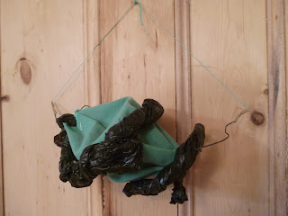
My first day in 3d design was fun. We had fabric, bin bags and other objects and we got to experiment and make objects with them. I loved using the new machines such as the eyelet machine. The welder was also fun. Anyway on creating the objects I realised they could be "worn" so Erin was a lovely model for me.
The Turban like object. The tape adds quite a lot of contrast as well as making the edges more pretty.

This weird object was fun to make. I like how the bin bags provide a more soft texture that contrasts the canvas. I had a lot of fun with the eyelet machine on this one. Thanks to the stiff fabric it sticks out quite a bit. held up it resembles a deformed dog.

Erin modelling various wearing methods. The second one is very witchy.
Then for homework (sorry, independent study)we had to explore methods of making a tube with a tube. We had to take stuff from college. It was, ummm, fun lets say to carry home when the heavens opened.
It was left quite vague so we would have our own ideas. I tried finding a promised powerpoint and googleing for ideas, but both methods failed to produce results so I just went for it.
"Tube" is loosely interpreted as twirly bit of wire and bin bag. A thin middle tube with pleats. I don't know if you could get anything as big as a pencil through it.


It makes me think of a weird headdress. one tube fills the other, stopping either from being a tube. I hope this doesn't make the brief null.

 My mum saw this and concluded I was off to a St. Paddy's parade. This first tube is the brown one, which is wire and tape, the second is the green fabric, about 4 times bigger and pulled through. It was really hard as the fabric was quite stiff and didn't want to do as I had hoped. I attached the bin bad in the hope it would convince it to do what I wanted. It didn't.
Due to my mums comment, I now have modelled it. I should be a hatter, but once again, no modelling talent. (I should have just called Erin).


Saturday, 12 October 2013

Ornamental Tree Mixed Media Stuff

We were doing some work on an object from home. I chose this ornamental tree (mainly because it is small and easy to carry).
I got it at London Zoo with some friends, so it may be nothing much but I like it.
Anyway I created some stuff based on looking at it:
These are roughly  in the order I finished them (some I started really early on them finished at the end when I had a new idea, and some of the first ones I made were so atrocious they got recycled as collage for other ones).
I wasn't too happy with this one because it was quick, messy and boring. The colour field is a bit meh. The inky scribbles were something I liked though.
 
This one was also quick, but its simplicity is quite nice. I did it with shoe polish and thread. I decided to leave it as it was because it was just a generally nice image.
 
You cannot tell with this one because I realise now it was not made for photography. It is a bucket load of paint with the image scratched into it. It is also simple and nice to look at (and quite nice to feel) . Just not good for photography.
Apart from the tape (which was a misjudgement) I think this  one looks nice. The 3D aspects of the leaves work well, and the angular use of the ink is effective.
I proceeded to see what Mark was doing next to me; a riot of colour and splashy stuff. Therefore (with his permission) I copied his idea, sticking with an orange colour field to suit my object. It certainly makes the image dynamic and was fun to create. The leaves could have worked better if I had been more careful with the negative shapes.
 
This is another colourful one. The big yellow patch is a mistake, I accidentally threw a milk bottle of ink at my paper, the wall, the floor, the cupboards (I could go on and on). It was dun to do, but hell to clean up. The splashy drippy effect is interesting at least.
After my first calm white background, I tried making a backing, covering it in white paint and scratching into it. Unfortunately it didn't occur to me that the paint would bleach the ink, so we got a barely visible print. I tried to rectify this by filling the negative space with an inky drawing I didn't like to much. I think it makes it work better, because you can see what's there, but it is still a bit dull.
Although I am quite critical, I actually am proud of my set and had loads of fun flinging paint and ink everywhere (including all over me). I enjoyed the self directed study as I had a chance to explore what I wanted to do, without having to stop after 15 minutes to go onto the next task.