Monday, 30 September 2013

Fine art artists

After a very long powerpoint skimming the surface of fine art artists, I needed to tell the world (that includes you) about the three I found most interesting.
Here we go:
 
© The estate of Louise Bourgeois
Cell (Eyes and Mirrors)
1) Louise Bourgeois
I found her very interesting on the powerpoint as I found that her art was beautiful and had a message, like her bullet series.
Looking her up, I found Cell a captivating work. It is very oppressive and it feels like it is some sort of alien watching you. This dystopian, modernist gothic image appeals to me.


2) Sophie Calle
Sophie Calle, ‘The Hotel, Room 28’ 1981
The Hotel, Room 28
What I like about Calle is her attention to the details of others lives. She explores stories and events. Things that have happened and could have happened. This seems magical to me.
Her very clinical way of displaying it makes me think of the modern age, but also leaves more of the story for you to make up your mind.


3) Erwin Wurm

Performative sculpture

Finally a fun artist to make me smile. Wurm does fun stuff like wearing a chair. I particularly like this image because it is so surreal and bizarre. The beast is two people messing around in a jumper.
It also reminds me of those snuggly jumpers for couples which in my opinion are never anything less than hysterically funny.


And that's all folks.


Fine art with just about anything

We started the fine art module today. I like it. After sculpting with paper(previous blog post) I had a ball making my own little paper sculptures. Then making images based on them.
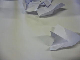
I chose the middle sculpture because it had the best balance (not that you can see that). It was not overly complicated, yet it had enough going on not to be boring.
Guess what the images below are made of...
Shoe polish!
The first one is me getting to grips with using the materials to add the polish and make the image, for example a toothbrush and a bit of cardboard. Its a bit overdone and focuses to much on trying to be accurate in a medium that is nearly impossible to be completely accurate with.
The second is more successful because I tried blending and the scores in the paper add interest without overpowering the image, but it is still a bit messy.
My most successful is my last. I added texture underneath by putting white acrylic on the paper first and masking tape. This adds texture which I think works well. I then used a more varied palette and blended better, creating a more diverse interesting image.

These are then thread and collage strips. The one on the left was done without stitch, just tape, so is looser. The one on the right is more precise. I think the image benefits from the added accuracy, but I feel the plain white background on both makes them a little boring.

Paper shapes

We each made these paper sculptures, here is mine.
 
You can't tell from the photo, but it was cone shaped. Anyway we experimented in groups of 7 in putting them together to create shapes. The only rule was that they should touch.
 
This was the first 'what are we doing?' go. It worked o.k but was a bit random.
 We then got the gist and had fun piling them on top of each other.

 This is a fun 'everybody blow our carefully piled sculpture' moment action shot.
 And the aftermath, worked quite well I'd say, not that I am any authority on the matter.
 This was an interlinking one, which was less interesting.
Ditto. 
We tried to see how high we could get them. (Not very high)
Our pride and joy; the shadow one, created by shining a phone torch onto the composition. You cant really tell in this image, but the shadow looked like a fox. It worked really well because the shadow added another dimension to the piece and made it look more architectural.

Saturday, 28 September 2013

Being influenced by 2D design

On a whole I would day I had most defiantly been influenced by 2D design in the past two weeks, mainly because I have been following my tutors advice.

Timorous Beasties
For starters I used to give a damn about the accuracy/ as to how my drawings were turning out. Now I just go for it, look at the mistakes and bits I don't like, note them, work over the top until I think it looks good.

I have to say, I found the illustration fun, cutting out stuff and making an image, but I think I'm best at the textile side, making textures and patterns.
I have to say I have been noticing 3D design more. When I see Green Eggs and Ham sitting on the table, I now think how was this created and if I think it worked well. I have also started to notice how just about everything needs a designer.

Sara Fanelli
A few people who's work I have seen have inspired me. Timorous Beasties for one. I find their complex patterns with a limited palette very interesting. I don't think you can see this in my work though. Tell me if you sniff any out.

Peter Barber with urban canvas was also very inspiring when he gave his talk, though he isn't really related to 2D design.

Hannah Hoch
Another person I found interesting was Sara Fanelli who's influence you might be able to trace in my use of bright colour and textures.

Richard Vergez
I also loved Richard Vergez. (Sorry I know the word love is banned). His work is so simple but expressive. His use of people defiantly influenced my (botched) attempt of illustration alongside Hannah Hoch. Her mutants hake me smile.

Overall I can assert I have had an inspiring two weeks that have revolutionised the way I draw and work. I now keep going, then take the bits I like the best out of everything I do. Its a certain freedom.


Life Drawing again

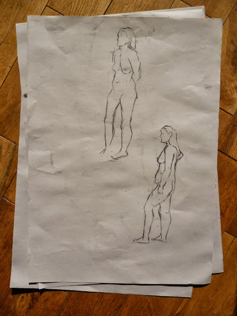
Life drawing at college. I seemed to find difficulty with the legs. I feel the board was too low for my height, but that's an excuse really. I just need to measure more carefully.

Sorry about the dodgy photos. I would blame the camera, but I think it may be my fault.

Thursday, 26 September 2013

Textiles and Bright things

You may or may not have seen my 'Drawing with a variety of things' post. If you have, you will be able to see what has happened. Anyway this is them now:


Little bit of a change, and fair to say, I'm much happier with them now. They actually look pretty when some of the busier stuff has been quietened down.
 

Wednesday, 25 September 2013

Finished my first art foundation sketchbook!

Just thought I would celebrate this fact with a few pictures:

Isn't its general plumpness just beautiful?

Illustrating a word

So here this is my sheet of 8 images, they are supposed to be illustrating a word.
See if you can guess what the word is:
 
Here they are close up:


Did you get it?
The word is in-between.
Here's how they show that if you didn't get it.
1. A child in between divorced parents
2.Limbo (in between heaven and hell)
3. Animals migrating between lands
4. A heart, between two lungs
5. Moving in between two houses
6. The teen-uni in between stage of life
7. Your own house in between neighbours
8. Dusk/Dawn; the in between time of day
I managed to get the grasp of simplicity a bit better towards the end. I hope you like them! Please comment if you have a favourite, because it would be fun to see which one was the most liked.
Here's a final titbit made from leftover bits which is now on the fire place.
 Just felt like showing the world.
 

Playing with collage

We did an illustration attempt in the style of people like Hollie Chastian, Daniel Zitlea and Paolo de Biasi among others. It was interesting, you need to have quite a witty mind in creating the images to give a message. It is also best when the images are at their simplest. These are the two things I'm worst at, but I will do my best to get the hang of it.
Here are my first attempts in my sketchbook:

I am not too gifted at the minimalist thing, and prefer to have lots going on, which doesn't suit this style which needs to present a clear image. My second is more effective than my first as it is simpler.
We also did 8 images to suit a word, but I haven't finished those yet. Will post when I do.

Monday, 23 September 2013

Peter Barber

 
We had an ex-student in today giving a talk about his work now. It was very interesting and my friend came out "inspired to paint". The ex-student was Peter Barber, a member of Urban Canvas (http://www.urbancanvas.co.uk/Home.html) who paints in a fine art style using spray paint. What I  found incredible was the sheer size of the images such as the biggest mural in Britain he did recently:

The skill on such a big scale is awe inspiring. What is also amazing is the speed which he works (the image above was done in a month) often completing work in a day or two.
He also talked about doing murals which had interactive projections over them. We watched a video (I don't seem to be able to find said video right now) and it looked really good.
The event was happening , and the mural evolved with the music and as people passed it. I was inspired by how different formats worked together so seamlessly to create such an incredible image.
Please do try and find the video if you have a moment. I would pull the web apart in a hunt if I wasn't knackered and thinking mournfully of bed.

All in all pretty good talk. I look forwards to the next artist's visit. Nighty night.

Drawing with stuff in a variety of ways

Good fun today. Got to finger paint (yay!)and draw with lots of stuff like masking tape. Its more of the very similar, but its slowly starting to look better (or my standards are lowering).


So I believe this accounts for a days work. That's nice.
 

Sunday, 22 September 2013

Life Drawing outside College

I go life drawing on a Sunday, so here's what I did (with added Chesterfield influences)


Saturday, 21 September 2013

The British Journal of Photography

I was looking at articles that interested me and I picked up the:

Website:http://www.bjp-online.com/
I was intrigued by the Madonna like front image and the complimentary pair on the cover.
Anywho flicking through I came across a few interesting articles;
Firstly I came across a short article about Nancy Newberry.
I had read about her pictures of "mums" before and found the symbolism and social status symbol of something so clownish intriguing. The ritual seems bizarre to me and Newberry's images do little to dispel this feeling of oddness.
What also interests me in Newberry's images is the relationship with space. Although the figures are most defiantly the focus of the image, they often seem engulfed by their surroundings, adding to the image of oddness.
 
Secondly there is Shirin Fathi's work
Fathi plays with gender and culture. Although her work relates to her own culture, we can all relate to the feelings shown in her images of being part of her own culture. She focuses on religious and mythical themes, which is a popular subject today and always.
Her gender politics are hidden in plain sight, which as someone who likes her ability to vote, therefore a feminist, appeals top me.
What I really liked was the statement that the images are not self portraits, rather Fathi's body is her tool.

Finally Gerwyn Davies's spread made me smile.
The images are so surreal. All the images are costumes, and have the odd quality of nearly but not quite blending in with there backgrounds. I have an interest in costumes, so this article attracted me. The images are undeniably cute and a bit funny, for example the blue mouse drinking through the tape.
These are also self portraits, but once again the self is hidden. Or maybe not. I guess you could say more of the self is revealed than in an image in which you could see the face, because you see inside their mind instead.
I'm not sure that sentence makes sense, oh well.
As you were.